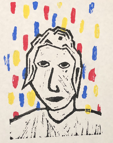
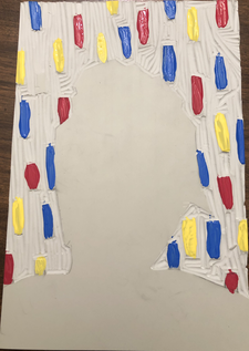
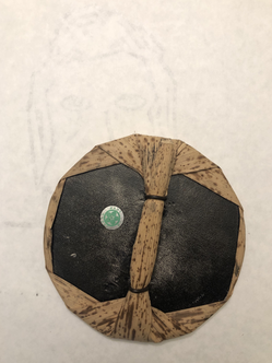
Artwork: Choice Piece- Block Print
|
Title: Then and Now
|
Exhibition Text
"Then and Now" was inspired by Picasso's "Self Portrait", (1907) and Piet Mondrian "Composition with Large Red Plane, Yellow, Black, Gray, and Blue", (1921). "Then and Now" represents the past and the present coming together. In the piece a young adult form is presented in the middle with falling blocks of red, blue, and yellow. These blocks are used to show childhood. During childhood is when basic life skills/needs are acquired. The coming together of these two elements is symbolic of how childhood prepares someone for the real world.
The artist who inspired "Then and Now" both believed that there was more than one way to make/create art however the basic fundamentals are needed. This idea can also be implemented in life, there is more than one way to succeed however the basics learned childhood are essential to acquire any type of success.
When selecting inspiration for this piece I researched many artists that were able to break away from the norm of creating art during their time period, this was important for me because it meant that they had a strong sense of what the principles and elements of art were. This was important for because I want to incorporate the Elements and Principles more in future projects that I create.
Inspiration

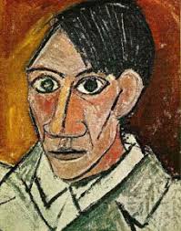
Pablo Picasso, (1907), "Self Portrait".
|
Picasso is known as one of the founding fathers of Cubism. Cubism is the abstraction of reality, artists such as Picasso would recognize how everyday life could be broken done to geometric and organic shapes. Picasso wanted to create a new way to perceive everyday reality.Often in Picasso's work multiple angles can be seen, this is another important aspect of Picasso's Cubism works.
These ideas of Cubism were influenced by African art and urban life in Paris. As well as Picasso growing interest in constructing and deconstructing. All of these aspects/ideas can be seen sprinkled throughout his Cubism work. |

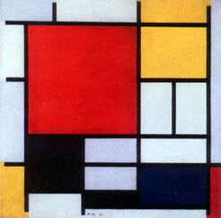
Piet Mondrian, (1921), "Composition with Large Red Plane, Yellow, Black, Gray, and Blue".
|
As an artist Mondrian has become most known for his abstract painting(such as the one presented on the left). When creating these abstract paintings he limited his color palette to black, white, blue, red, and yellow. This simplification is what set him apart from other artist during the 20's. Many of these works are asymmetrical, however almost all feature black solid lines that vary in thickness and varying sizes of rectangles/squares.
His abstract pieces are often referred to as grids with many overlapping intersections made up of horizontal and vertical lines. Mondrian was able to perfect hi abstract craft during 1914 when he went to visit his sick father in Paris, during this time he was not allowed to leave due to WW1. To pass the time he dove deeper into his abstract paintings. |
Planning
|
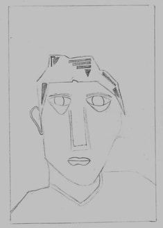
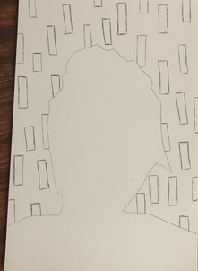
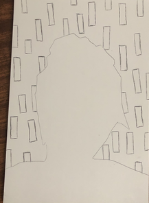
This first sketch I wanted to mainly focus on turning the human face into geometric and organic shapes. I found that when doing this it was easier to start with the larger facial features like the nose and eyes. Another thing I focused on during this sketch was the hair, it was difficult to draw the hair only using straight lines. This sketch was important because I was figuring out the basics of turning the human form into basic shapes in lines.
This sketch ended up stirring away from what I initially wanted, the expression on the face contradicts the message behind the piece. The eyes that I drew almost look angry which is not how I wanted them to look. However this sketch is the one I think was the most successful because I was able to create a human form by only using organic and geometric shapes. |
|
|
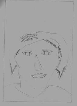
With this sketch I experimented with the size and shape of the facial features and hair. I made everything smaller and more messy, in the end it ended up looking more like a child. This sketch contradicted the theme of the piece. Through this sketch I figured out that if the human form appeared to be older it would better fit with the theme of the piece.
As well I noticed the the proportions of everything seemed to be off, this differs from Picasso's "Self Portrait" because although some facial features are over sized he balanced the face by making the other features larger. The problem with this sketch is the size of the nose as well as the size of the chin, every other feature compared to these two look out of place. |
|
|
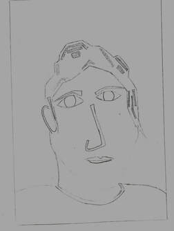
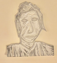
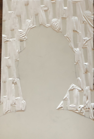
My last sketch is the closest to my inspiration. When creating this sketch I payed more attention to the smaller details in Picasso's piece, such as the positioning of the neck and the space between each facial feature. The only parts of the original piece that I didn't know if I wanted to include were the eyebrows and the ear. I noticed that the eyebrows that Picasso drew were two thin curved lines which would be hard to accomplish in my chosen media(when carving the piece I decided to get rid of them). As well I couldn't figure out how to draw the ear in a way that would be easy for me to carve, so when I transferred this image onto the linoleum I didn't include it.
|
|
After completing all three sketches I was most happy with how sketch 3 turned out, after making some final adjustments this was the sketch I used for the final piece.
Experimentation
|
I had to find a way to cut the linoleum so that when I printed it the background was not black. Typically when a print is made the background is solid black, for my piece I didn't want this to distract from the bright hues in the background. I knew that I could cut the linoleum with scissors, so I first transferred the image by sketching it directly on the linoleum. After I carved the linoleum I cut the figure I created out. I then traced the shape on a second piece of linoleum so I knew where I could cut for the background.
|
|
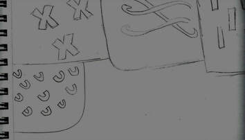
The main part of my experimentation was the pattern in the background. For this project the main thing that I had to figure out was what pattern I wanted. I knew that the pattern would have to be colorful and simple so it wouldn't over power the final piece , I started by sketching some ideas. I found that it was best if the pattern went vertical to the human form so that it would create a higher contrast.
Once I chose the pattern I liked the most I experimented with ways I wanted to transfer the pattern, I mostly experimented with different colored acrylic paint. In the end I decided to use blue, yellow, and red so that I could connect this to my inspiration. |
Process
|
The first step was to transfer the sketch onto the linoleum. After this was done I began to carve the piece. I found that it was easier for me to shade in the parts that needed to be carved out. Another thing that I did to make it easier on myself was I used a carving tool to trace around all the edges so that they would be clean. When carving I used two different tools, the first one I used was a u shaped tool which was better for removing larger parts of the linoleum compared to the v tip toll which I used to carve around the edges and get into smaller spaces like the eyes.
|
|
|
I then cut out the figure making sure to get as close as possible to the edge without cutting the piece. I placed the cut out form on top of another piece of linoleum and traced it, I did this so I knew where I couldn't put the background pattern.
I next began drawing the pattern for the background, When I begin drawing the pattern I tried to make them all around the same length and width. For this step I didn't use a ruler because I felt that it would go against the theme of childhood. |
|
|
After the pattern was drawn I carved the background. I used the same method I used to carve the form, going around all of the edges of the details then carving the rest. When doing this step it was important that I didn't cut where the form was going to go.
A problem that I ran into was cutting the corners, although in the final piece it isn't really noticeable. I think that if I used a smaller tool this wouldn't have happened, however in the end it didn't really end up affecting much. |
|
|
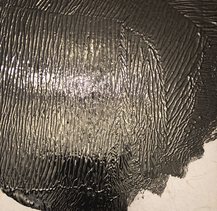
To start the actual printing process I first got the ink and paint ready. I placed the ink on a metal tray and used a brayer to spread it around until it looked like the image on the right. This was an important step other wise the ink would not print right. To prepare the paint I placed some blue, red, and yellow paint in a piece of palette paper. The colors that I chose were called Red, Bright Yellow, and Dark Blue. I liked these colors because they were bright but dark enough that they would be seen once they were printed.
|
|
|
I wanted to print the background first so that it would be easier to line up the form. I used a small paint brush to apply the paint to the pattern. When I was doing this there was no specific order I wanted the colors I just tried to keep the colors separated so that no two rectangles/squares next to each other were the same color.
It ended up being harder then I thought to paint the pattern, however in the end I liked how they looked kind of messy. |
|
|
I then used a baren to transfer the background design onto a piece of drawing paper. I tried to place the drawing paper in the middle of the linoleum so that the boarders around the piece were even. When I began the printing process I applied a decent amount of pressure so that the paint would be solid with no white showing through.
|
|
|
Next I used the brayer to apply the ink to the form. I went over the piece with the ink about 2 to 3 times so that it would print solid black. Again I tired to place the piece of drawing paper in the middle so that the space I left in the background would be filled by the form. After I was happy with the placement I used the baren and applied a little more pressure to the form, I did this because I learned from the last time I did block print that the image will be more clear if you apply more pressure.
I repeated this process until I was happy with the way a print turned out. |
|
Reflection
After completing the project I am happy with how everything turned out. I like that there is a high contrast between the background and the from, but they are tied together because the shapes in the pattern appear in both. When creating the background I could have found a better way to transfer the background, I could have used color based water inks, or directly painted the background on. However both new solutions would present more problems to arise then I had with my original technique.
If I were to add to this piece I most likely would have added some type of texture to the background. By doing this the piece would have more depth and a higher contrast. I could have used embroidery thread to fill in some of the shapes that appear in the background. I think that having a mixture of the acrylic and the embroidery would have strengthened the meaning behind this piece.
If I were to add to this piece I most likely would have added some type of texture to the background. By doing this the piece would have more depth and a higher contrast. I could have used embroidery thread to fill in some of the shapes that appear in the background. I think that having a mixture of the acrylic and the embroidery would have strengthened the meaning behind this piece.
Compare and Contrast
|
|
|
"Self Portrait" and " Then and Now"
Similarities:
~ Both pieces have broken the human form into organic and geometric shapes.
~ The position of the forms in both pieces are similar.
~ The expression on the faces are similar.
Differences:
~ Picasso's piece has a warmer color scheme.
~ The form in Picasso's piece has more dimension.
~ The background in "Then and Now" has more negative space.
~ A light source can be pointed out in Picasso's piece.
"Composition with Large Red Plane, Yellow, Black, Gray, and Blue" and " Then and Now"
Similarities:
~ The color schemes are similar.
~ Both pieces are made up of geometric shapes.
~ Both pieces have a high contrast between color and solid black lines/shapes.
Differences:
~ "Then and Now" has a human figure.
~ The pattern in Mondrian's piece is more complex compared to the background of "Then and Now".
~ In Mondrian's piece the shapes vary in size, were as in "Then and Now" are vary similar in size.
Similarities:
~ Both pieces have broken the human form into organic and geometric shapes.
~ The position of the forms in both pieces are similar.
~ The expression on the faces are similar.
Differences:
~ Picasso's piece has a warmer color scheme.
~ The form in Picasso's piece has more dimension.
~ The background in "Then and Now" has more negative space.
~ A light source can be pointed out in Picasso's piece.
"Composition with Large Red Plane, Yellow, Black, Gray, and Blue" and " Then and Now"
Similarities:
~ The color schemes are similar.
~ Both pieces are made up of geometric shapes.
~ Both pieces have a high contrast between color and solid black lines/shapes.
Differences:
~ "Then and Now" has a human figure.
~ The pattern in Mondrian's piece is more complex compared to the background of "Then and Now".
~ In Mondrian's piece the shapes vary in size, were as in "Then and Now" are vary similar in size.
ACT Reflection
Clearly explain how you are able to identify the cause effect relationship between your inspiration and its effect on your artwork?
The pieces I used included three main aspects line, shape, and color. The piece I created incorporates all three, and like my inspiration the piece appears to be simple.
What is the overall approach the author has regarding the topic of your inspiration?
The overall approach was to find artists that were highly skilled which allowed them to create pieces that appear to be simple but are actually highly technique.
What kind of generalizations and conclusions have you discovered about people, ideas, culture, etc. while you researched your inspiration?
I was able to discover how people within clusters of cultures are always involving, and finding new ways to expresses themselves within those cultures. Thus allowing them to advance in the world.
What is the central idea or theme around your inspirational research?
The central idea behind my inspirational research was artist who incorporated the basic principles and elements of art to create highly technical pieces.
What kind of inferences did you make while reading your research?
An inference that I can make is that artists in the past who broke away from the norm of art continue to influence how and why art is created in the 21st century.
Bibliography
Israel, Matthew. “The Artistic Evolution of Piet Mondrian.” 11 Artworks, Bio & Shows on Artsy, Artsy, 20 Mar. 2015, www.artsy.net/article/matthew-how-mondrian-went-abstract.
“Pablo Picasso and Cubism.” Marc Chagall's Stained Glass Windows, news.masterworksfineart.com/2018/10/31/pablo-picasso-and-cubism.
“Piet Mondrian Artworks & Famous Paintings.” The Art Story, www.theartstory.org/artist-mondrian-piet-artworks.htm#pnt_4.
“Pablo Picasso and Cubism.” Marc Chagall's Stained Glass Windows, news.masterworksfineart.com/2018/10/31/pablo-picasso-and-cubism.
“Piet Mondrian Artworks & Famous Paintings.” The Art Story, www.theartstory.org/artist-mondrian-piet-artworks.htm#pnt_4.
