
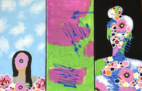
Artwork: Tryptic
Title: Adapting
Size: 60 cm x 30 cm (3 panels)
Medium: Acrylic on Canvas
Completion: 2019, April
Exhibition Text
"Adapting" was inspired by the artists Rene Magritte and Stephanie Peters. "Adapting" consists of three panels, each represents a different part of the relationship that is formed by a person and their environment(s). To accurately portray this relationship I incorporated at least one aspect from all of my inspiration in to each piece, these similar elements that appear in each of the three form a physical connection between the pieces. As well as adding a sense of movement because it appears in all three of the pieces. The first panel represents who I am, the second is how the environment effects me, and the third shows how I want to effect my environment.
Inspiration
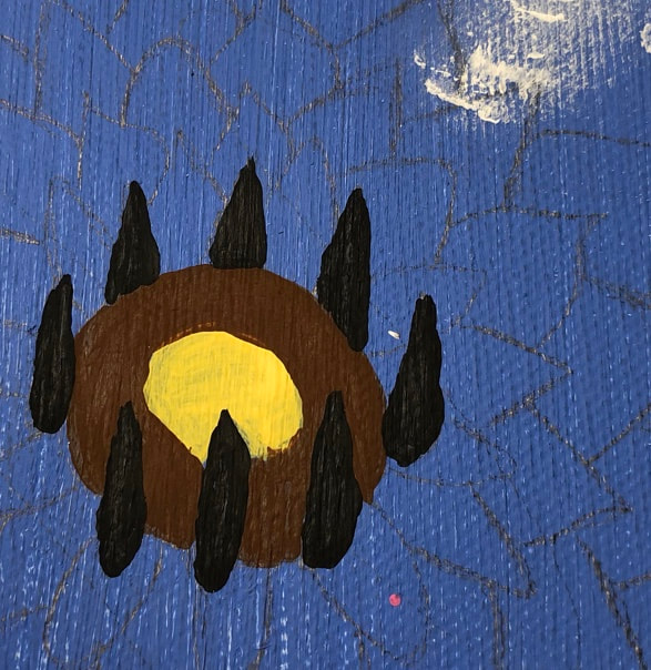
Magritte was apart of the Surrealism movement, this movement is known for often tapping into the unconscious mind. Magritte was able to achieve this through his simplicity of his works that often provoked unsettling thoughts in his viewers. Many of his works included forms and figures. The colors he often painted with were vibrant and dark. Though his paintings appear to be simple he payed a high amount of attention to the details of his work, for example shadows and highlights. This attention to detail allows Magritte work to further show the motives behind surrealism artists.
|
|
|
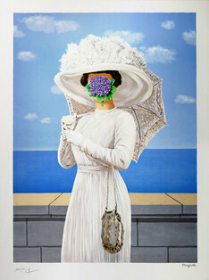
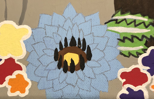
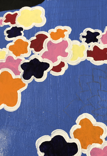
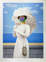
Rene Magritte, " La Grande Guerre".
|
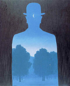
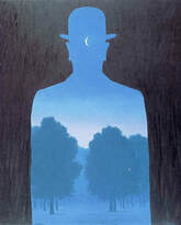
Rene Magritte, (1964), " A Friend of Order".
|

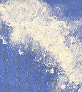
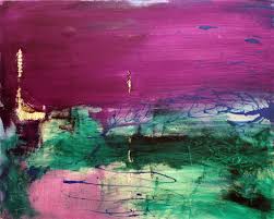
Stephanie Peters, (2011), "Tornado".
|
This particular painting was created for a series called "Natural" Disasters". The idea behind this series is to show the disaster and how the earth and people recover after. The series was brought to light because of the increase in pollution, climate change, ect which causes these disasters to occur more frequently. Each piece uses color and movement to show the disaster, and the sewing that appears in each is to show the recovery that occurs after each.
|
Planning
|
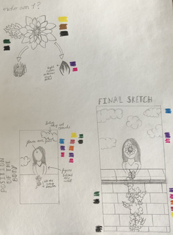
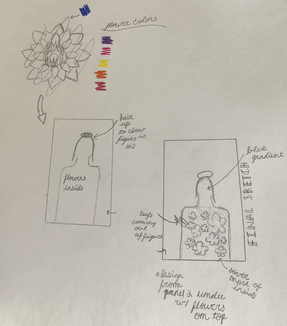
When planning what I wanted to do I decided I wanted at least one inspiration specifically for each panel.
My first sketch was inspired by Magrittes “La Grande Guerra”. In my initial final sketch I wanted to closely follow my inspiration, however after beginning the actually painting process I decided that I didn’t really have a reason for incoopretating the water and brick wall, so I got rid of them. As well when initially palinnign I knew I wanted to only put one flower on the face to make it easier for myself, during this I also began to plan what colors I wanted to inccoperate. I did this so I would be able to see what colors could be potentially incoperated into all three which would create a sense of movement and connectives between the three panels. |
|
|
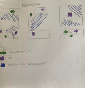
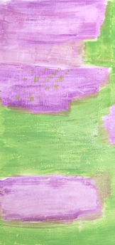
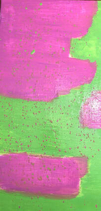
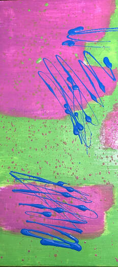
The main source of inspiration for the sencind panel comes from “Tornado”. This panel was probably the most difficult for me to plan for because I didn’t want to completely copy the layout, I more wanted to mimic the movement and blending of the colors. As well I decided that I didn’t want to use to many colors because if they blend together to much then they would have created a brown color. In the end I settled on three colors, a pink-purple, a green, and a dark blue.
|
|
|
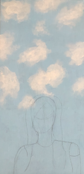
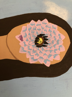
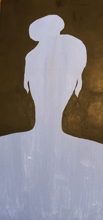
The last panel was inspired by “A Friend in Order”. When completing my sketches for this panel I knew I wanted to show that the figure was a female this is why the figures hair is in a bun. As well in “A Friend in Order” the inside of the figure is filled by a house in the night. I wanted to inccooperate the parts of my inspiration that struck out to me the most, in the end I decided that the important elements were the clouds, flowers, and the patches of watercolor.
|
|
Experimentation
|
After I found my inspiration for panel two I had to find a way to create a watercolor effect with acrylic paint. Before this project I had previously completed mono printing, I decided to use the technique of adding a lot of water to the paint witch gives the paint the same effect as watercolor. What I learned from doing the mono printing was that you can already add more paint to darken the color, as well that if you don’t have enough water it n the brush then the paint will just come off streaky.
|

|
The second part of my inspiration was creating clouds in a small area/space. This was a challenge for me because I couldn’t soften the edges as much as I wanted to, to solve this issue I used a smaller stuff brush and a smaller amount of paint so that I could have more control of how and where the paint went.
|
Process
Preparation Before Painting
|
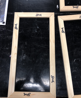
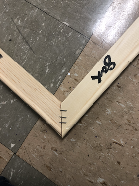
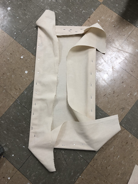
Before I could begin painting I had to construct the canvas. I first started by connecting the stretcher bars, after I had three I used a triangle square to make sure that each corner was even.
|
|
|
I then used a staple gun to connect the stretchers together, I put three staples in each corner.
|
|
|
Lastly I attached the actual canvas to the stretchers and applied two layers of gesso.
|
|
Painting Panel 1
|
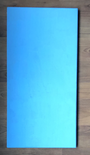
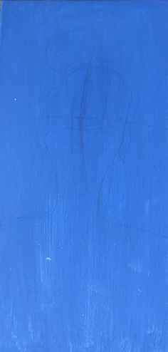
The first thing that I did was paint the background color. I knew I wanted the background to be a light blue like in my inspiration, I made this blue by mixing pale blue, island blue, and grey together. I applied two coats of this color.
|
|
|
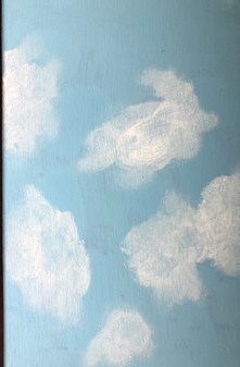
After the background color had completely dried I moved onto completing the clouds. First I took a large amount of titanium white on a large circular stiff brush to create the basic shapes of the clouds. When I was happy with the shape of each cloud I went in with a smaller circular brush to soften the edges and darken the middle of the clouds.
|
|
|
|
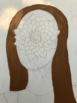
This is where I actually sketched my design onto the canvas. I first redrew the image on a piece of paper, added a grid, and then transferred the image onto the canvas. This is where I decided that I no longer wanted to include the brick wall.
|
|
|
|
|
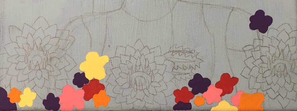
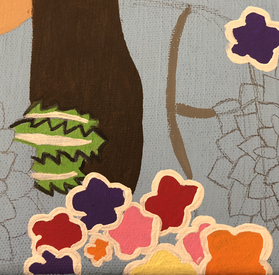
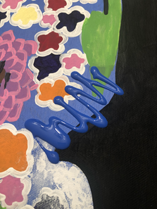
After everything was sketched out I began painting the smaller flowers, the colors I used for these were violet, orange, pink parfait, light yellow, and red. Since the colors I decided to use were lighter colors I had to apply about 3 or 4 layers of paint for each flower. To apply the paint I used a small flat brush.
|
|
|
The next part that I completed was the hair, to create this color I mixed brown and black. I applied this color using a medium sized flat brush and a small angled brush to go around the edges of the hair.
|
|
|
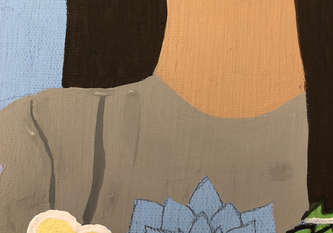
I then used red, titanium white, bright yellow, and brown to create a skin tone. To apply this paint I used a small pointed brush to create a nice edge between the hair, flower, and the shirt. To show where the head and neck meet I added more brown to the original skin tone I created.
|
|
|
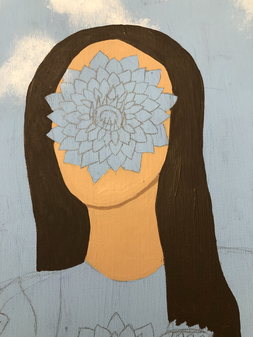
I wanted to add more value to the smaller flowers so I outlined each one with titanium white with a small pointed brush. While waiting for that to dry so I could do another layer I painted the leafs. I first outlined each leaf with black, I used a small pointed brush. I next painted the white strip, I used titanium white on a small flat brush. Lastly I used holiday green on a small flat brush to complete the leaves.
|
|
|
After the outlines of the flowers were completely dried I moved onto the shirt. To complete the shirt I first mixed grey with black to show the seams of the shirt I was wearing. I then filled in the remaining parts of the shirt with grey on a medium flat brush. In my inspiration the figure is wearing all white but since I used white to outline the flowers I used grey to paint the shirt because I didn't want the two to blend into each other.
|
|
|
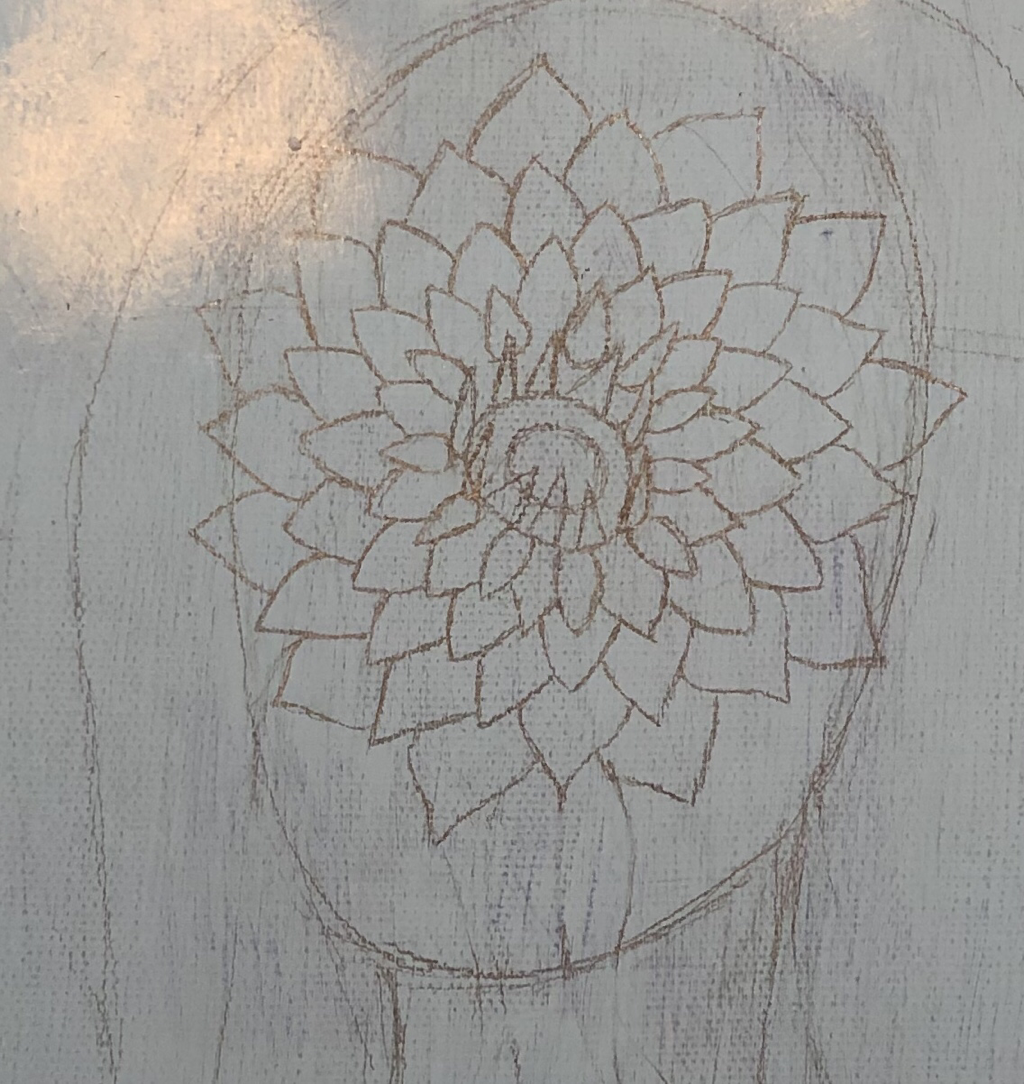
I next began to paint the larger flowers. I started with the middles of the flowers . I used a small pointed brush to apply all three colors. I mixed bright yellow and sunny day to create the color for the center circle, next I used brown to fill in the outer circle, and lastly I used black to fill in the petals that were sticking straight up.
|
|
|
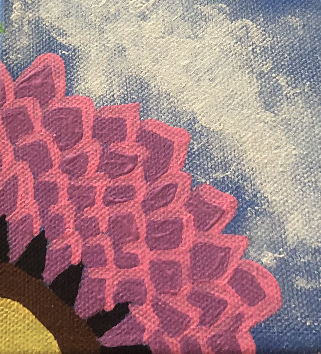
I then outlined all of the petals with pink parfait mixed with titanium white, I used a small pointed brush. After I began to fill in the actual petals to do this I mixed purple with pink blast.
|
|
|
Next I completed the two larger flowrs of the sides of the canvas. First I applied a layer of purple mixed with pink blast with a large flat brush. Once that dried I took the same colors I used to paint the smaller flowers and poured them directly onto the canvas.
|
|
|
After that was dried I used a small flat brush to apply an outline of titanium white, this created the actual flower shape.
|
|
Painting Panel 2
|
Since I couldn't complete a sketch of this panel I started by mixing the main colors I wanted to use. I mixed purple with pink blast, and holiday green with titanium white. I then took a large flat brush that I let sit in water and mixed it with the purple-pink color I created before applying it to the canvas. i did this to create a water color effect because the inspiration for this piece was created using watercolor. I repeated the same steps with the green.
|

|
|
After the wash had dried I repeated the same steps as I did to complete the wash. After I was happy with the way the colors looked I used the left over paint of both colors to splatter it onto the canvas.
|
|
|
After all of that dried I poured bright blue directly on the canvas in a similar style to the inspiration behind panel 2.
|
|
Painting Panel 3
|
I first sketched out the figure and all of the details that would appear on the inside. I did the details on the inside very lightly because many of the colors that I would end up using would be very light colors.
|
|
|
I then used a large flat brush and a small pointed brush to paint the black that appears in the background.
|
|
|
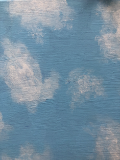
After that dried I began to paint the clouds. I used the same brushes and techniques that I used on panel 1 because I wanted the clouds to look similar to each other.
|
|
|
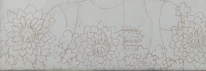
After the clouds were dry I painted the smaller flowers. Again I used violet, orange, light yellow, red, and pink parfait. I then used a small pointed brush to outline the flowers I applied two layers to each of the flowers outlines.
|
|
|
Next I painted the larger flowers, I used the same colors and brushes that I used on panel 1. I applied two to three coats of paint because the blue of the background is darker then panel 1.
|
|
|
|
Lastly I used a similar technique to the one I used to complete panel 2. However on panel 3 I used a small flat brush because I only wanted a small portion of this panel to reflect panel 2. After that dried again I poured bright blue directly onto the canvas.
|
|
Reflection
After completing the three panels I am most happy with the way that the third panel turned out. I think that I like this the most out of the three because I was able to incooperate details from the other two panels that I liked. If I were to change one thing about this panel it would be the position of the clouds, I would move them closer to the middle so that i could soften the edges more. By doing this they would look more realistic but also more similar to the clouds in the first panel.
Looking at at my other two panels I think that in the first panel I could have added another coat of the blue that I used for the background, now looking at the completed panel there are some areas where you can see the gesso underneath.
The second panel i think think I had the best plan for which is why it was able to turn out so successful. The only thing that I would change about this panel would be to make the green darker since the purple and blue are darker colors.
Compare and Contrast
|
|
|
|
"La Grande Guerre" & "Adapting"
Similarities:
- In both pieces there are figures that are placed in the middle of the pieces
- The figures both are women who features are covered by a flower
- The clothing shown in both are monotone colors
- The most detail is present in the flower and in the backgrounds of both pieces
Differences:
- In “Adapting” the face is covered by a singular flower, where as “La Grande Guerre” the face is covered by multiple small flowers
- “Adapting’s” background is composed of a simple blue sky with clouds where as “La Grande Guerre’s” background is composed of the sky, body of water, and a brick wall
- “La Grande Guerre” has a higher attention to shadow and highlights
"A Friend in Order" & "Adapting"
Similarities:
- Both pieces are composed of a black background
- Both use the human form to create a window of some sort
- In the inside of the human form there are multiple elements happening
Differences:
- “Adapting” features a female figure where as “A Friend in Order” features a male figure
- In the inside of “A Friend in Order” there is a more coherent sense taking place compared to “Adapting”
"Tornado" & "Adapting"
Similarities:
- Both pieces appear to have a watercolor look
- The pieces are composed of only a few colors
- Both pieces feature paint being poured directly on the canvas
Differences:
- “Tornado” was created using watercolor paint, where as “Adapting” was made using acrylic paint mixed with a large amount of water
- “Tornado” can be considered a mixed media work because thread was used as a main component in understanding the meaning behind the piece
- “Adapting” does not have as much movement as “Tornado”
Similarities:
- In both pieces there are figures that are placed in the middle of the pieces
- The figures both are women who features are covered by a flower
- The clothing shown in both are monotone colors
- The most detail is present in the flower and in the backgrounds of both pieces
Differences:
- In “Adapting” the face is covered by a singular flower, where as “La Grande Guerre” the face is covered by multiple small flowers
- “Adapting’s” background is composed of a simple blue sky with clouds where as “La Grande Guerre’s” background is composed of the sky, body of water, and a brick wall
- “La Grande Guerre” has a higher attention to shadow and highlights
"A Friend in Order" & "Adapting"
Similarities:
- Both pieces are composed of a black background
- Both use the human form to create a window of some sort
- In the inside of the human form there are multiple elements happening
Differences:
- “Adapting” features a female figure where as “A Friend in Order” features a male figure
- In the inside of “A Friend in Order” there is a more coherent sense taking place compared to “Adapting”
"Tornado" & "Adapting"
Similarities:
- Both pieces appear to have a watercolor look
- The pieces are composed of only a few colors
- Both pieces feature paint being poured directly on the canvas
Differences:
- “Tornado” was created using watercolor paint, where as “Adapting” was made using acrylic paint mixed with a large amount of water
- “Tornado” can be considered a mixed media work because thread was used as a main component in understanding the meaning behind the piece
- “Adapting” does not have as much movement as “Tornado”
ACT Response
Clearly explain how you are able to identify the cause effect relationship between your inspiration and its effect on your artwork?
The connection between my inspiration and my work can be clearly seen in all three panels. My inspiration focuses more on conveying emotions without truly showing a human face, this can clearly be seen in my work.
What is the overall approach the author has regarding the topic of your inspiration?
The overall approach was to find pieces with a high amount of emotion rooted in the meaning in the pieces.
What kind of generalizations and conclusions have you discovered about people, ideas, culture, etc. while you researched your inspiration?
One generalization that I can now make is that as people we form relationships with almost everything that we encounter in our daily lives
What is the central idea or theme around your inspirational research?
When I was looking for inspiration I knew that I wanted to find pieces that didn’t include the human facial features. As well I wanted at least one piece that was more abstract because I never have created work based of something like that.
What kind of inferences did you make while reading your research?
An inference that I can make is that as an artists you don’t need to show a human face to convey a sense of emotions.
Bibliography
“Natural Disasters.” Stephanie Peters - Fine Art, www.stephartist.com/natural-disasters.html.
“René Magritte Paintings, Bio, Ideas.” The Art Story, www.theartstory.org/artist-magritte-rene.htm.
“René Magritte Paintings, Bio, Ideas.” The Art Story, www.theartstory.org/artist-magritte-rene.htm.
