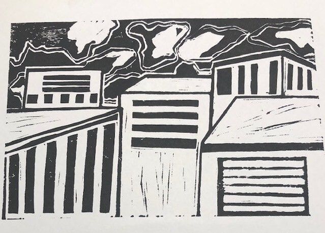
Artwork: Block Print

|
Title: Windows
|
Exhibition Text
"Windows" is inspired by the artist Edward Hopper, his pieces "Night Windows" and " Office in a small City". The theme behind "Windows" is how our environments affect and shape us as people. This piece uses line and shadows to emphasize the reflection process.
Inspiration

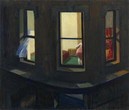
"Night Windows", (1928), Edward Hopper
|
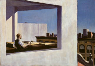
"Office in a Small City", (1953), Edward Hopper
|
The inspiration for my piece comes from the artists Edward Hopper. His works often follow a similar pattern. His pieces depict a highly detailed cityscape, with high levels of shadows and highlights. The forms he depicts are isolated and disconnected from their environments. This contrast of the city and figures forces the viewers to focus on the city more, the tension created by this adds to the underlying theme of everyday life.
When creating my piece I wanted to in cooperate the high contrast of light and dark, this would be easier to achieve with my chosen media because block print prints black and white. However unlike Hopper's works I wanted to focus on city solely. For a lot of my other pieces I focus on human emotions. With this piece I wanted to focus on how we become the people we are, humans are shaped by not only other people but heir physical environments.
When creating my piece I wanted to in cooperate the high contrast of light and dark, this would be easier to achieve with my chosen media because block print prints black and white. However unlike Hopper's works I wanted to focus on city solely. For a lot of my other pieces I focus on human emotions. With this piece I wanted to focus on how we become the people we are, humans are shaped by not only other people but heir physical environments.
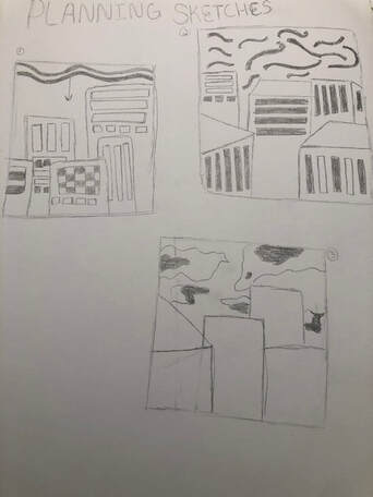
Planning
Sketch 1: In this first sketch all of the buildings are facing towards the front, and the sky is made up of curved lines that would alternate between white and black. I didn't really like sketch because the positioning of the buildings looked to basic and didn't resemble a real city. However I did like the different types of windows. Regarding the sky I felt that it looked to unrealistic for what I was trying to achieve with this piece.
Sketch 2: In this sketch the buildings are positioned in different directions, compared to my first sketch I preferred these buildings because they were more realistic. I liked the idea of seeing the tops of the buildings that were closer and only seeing the front of the buildings that appeared in the background. However I felt that the windows on these buildings looked to similar. Again I didn't like the look of the sky, however comparing sketch 1 and 2 I preferred the sky in 1. In this sketch I felt I went to abstract with the clouds witch wouldn't add anything to my piece.
Sketch 3: With this sketch I focused on the sky. I decided that I liked the positioning of the buildings from sketch 2, so I kept them the same. I ended up liking this sky the best compared to the other 2. They clouds looked more realistic and provided high contrast which is what I wanted for my piece.
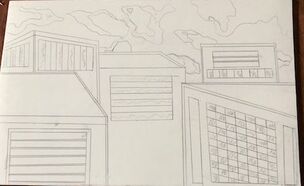
The final idea I went with for the piece was the buildings from sketch 2 and the sky in sketch 3.
Sketch 2: In this sketch the buildings are positioned in different directions, compared to my first sketch I preferred these buildings because they were more realistic. I liked the idea of seeing the tops of the buildings that were closer and only seeing the front of the buildings that appeared in the background. However I felt that the windows on these buildings looked to similar. Again I didn't like the look of the sky, however comparing sketch 1 and 2 I preferred the sky in 1. In this sketch I felt I went to abstract with the clouds witch wouldn't add anything to my piece.
Sketch 3: With this sketch I focused on the sky. I decided that I liked the positioning of the buildings from sketch 2, so I kept them the same. I ended up liking this sky the best compared to the other 2. They clouds looked more realistic and provided high contrast which is what I wanted for my piece.
The final idea I went with for the piece was the buildings from sketch 2 and the sky in sketch 3.
Experimentation
|
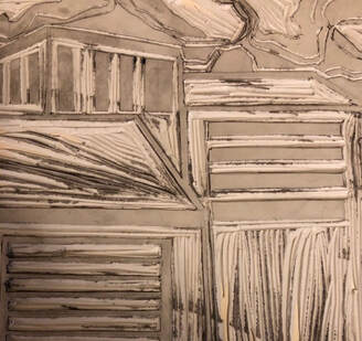
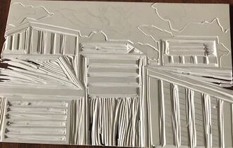
The first problem I ran into was the buildings looked to similar to each other, I wanted it to look some like a real city where the buildings are different sizes with different windows shapes and sizes.
After doing my first print I had to re carve some of the windows. I found that having a mix of white and black windows looked better rather then having all of the windows be black. This small change helped the overall look of the piece. |
|
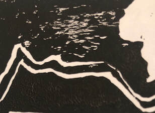
When printing I had to experiment with the amount of ink I placed on the linoleum and the pressure I applied with the barren. I found I got better results if the ink was placed in even coats. The print was more clear when I applied a heavy amount of pressure, if I didn't there were some spots that remained white.
|
Process
|
Once I chose a sketch I was happy with I transferred it onto the linoleum. When completing this step I used a ruler, witch would help me better emulate the look of real buildings.
|
|
|
I then began to carve the linoleum. I started with the buildings because I knew that I would struggle with this element the most. Again I used a ruler to emulate the look of real buildings. Once the buildings were completed I moved onto the sky.
|
|
|
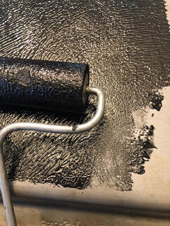
The next step was to prepare the ink. I began by placing a small amount of ink onto a metal sheet, then using a brayer I rolled the ink until it looked like the picture on the right.
|
|
|
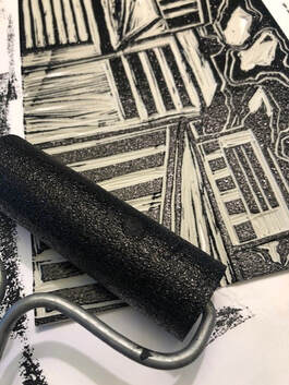
Again taking the brayer I applied the ink onto the linoleum. When doing this I applied thin layers of ink, I applied the ink until the whole sheet was covered evenly.
|
|
|
I then placed a piece of paper onto the linoleum, using a barren I applied a heavy amount of pressure onto the paper. By doing this I would be able to achieve a clean print.
I repeated the last two steps two more times before I got a print I was happy with. |
|
Reflection
Overall I think that my piece is successful in conveying the ideas I wanted. I think I was able to successfully create a high level of contrast through the use of the colors black and white. However I think if more of the sky was white the overall look of the piece would be better. As well I like how the windows look similar on each building, this creates a sense of unity between the buildings witch pulls the piece together.
Compare and Contrast

|
|
|
"Office in a Small City" v "Windows"
Similarities:
- Both pieces showcase buildings up close and in the distance
- There are numerous sized windows that show up throughout both
- The pieces both showcase a city of some kind
Differences:
- No forms appear in "Windows"
- The colors scheme is " Office in a Small City" is wider then the one that appears in "Windows"
- The sky in "Windows" is much darker then the sky in "Office in a Small City"
"Night Windows" v "Windows"
Similarities:
- Both pieces have a high contrast of light and dark
- The windows that appear in both are varies sized squares
Differences:
- No forms appear in "Windows"
- Unlike " Night Windows" there is not one specific light source in "Windows"
- There is no sky that appears in "Night Windows"
Similarities:
- Both pieces showcase buildings up close and in the distance
- There are numerous sized windows that show up throughout both
- The pieces both showcase a city of some kind
Differences:
- No forms appear in "Windows"
- The colors scheme is " Office in a Small City" is wider then the one that appears in "Windows"
- The sky in "Windows" is much darker then the sky in "Office in a Small City"
"Night Windows" v "Windows"
Similarities:
- Both pieces have a high contrast of light and dark
- The windows that appear in both are varies sized squares
Differences:
- No forms appear in "Windows"
- Unlike " Night Windows" there is not one specific light source in "Windows"
- There is no sky that appears in "Night Windows"
ACT Response
Clearly explain how you are able to identify the cause effect relationship between your inspiration and its effect on your artwork?
Edward Hopper focused on the interactions of humans with their environments. My piece focuses on the environment part of the relationship. The relationship between the pieces is shown through similar themes.
What is the overall approach the author has regarding the topic of your inspiration?
In the past I mainly focused on humans and their emotions, with this piece I wanted to focus on what causes humans to react differently. Everyone is around different environments, this is what I wanted to focus on.
What kind of generalizations and conclusions have you discovered about people, ideas, culture, etc. while you researched your inspiration?
We are highly shaped and influenced by the environments we put ourselves, this is why people are so different from each other because everyone has different lives.
What is the central idea or theme around your inspirational research?.
I wanted to find an artist that focused on human surrounding rather then humans their selves. Hopper was able to do this by making the human form feel distanced from their environments.
What kind of inferences did you make while reading your research?
An inference I made was there is a deep connection between people and their environments. This connection forms a person to who they are.
Bibliography
“Edward Hopper Paintings, Bio, Ideas.” The Art Story, www.theartstory.org/artist/hopper-edward/.
Hopper, Edward. “Edward Hopper. Night Windows. 1928: MoMA.” The Museum of Modern Art, www.moma.org/collection/works/79270.
Metmuseum.org, www.metmuseum.org/toah/works-of-art/53.183/.
Hopper, Edward. “Edward Hopper. Night Windows. 1928: MoMA.” The Museum of Modern Art, www.moma.org/collection/works/79270.
Metmuseum.org, www.metmuseum.org/toah/works-of-art/53.183/.
