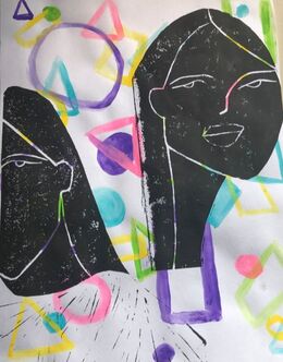
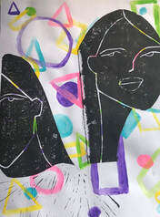
Artwork: Mixed Media Block Print
|
Title: Inserts
|
Exhibition Text
¨Inserts¨ was inspired by a series called Idle Youth by the artist Johanna Olk. Her works consists of simple line work that convey heavy emotions. ¨Inserts¨ emulates these same ideas however in a much more geometric way. The pieces presented in the Idle Youth series present colorful clothing and backgrounds. This detail was manipulated in ¨Inserts¨ which allows me as the artist to dive into the idea of lines and colors impacting the emotions evoked when viewing a piece. The simple makeup of ¨Inserts¨ reveals the inner thoughts and feelings that are often hidden away in order to appear like everyone else. The black and white forms are hindering the bright colors from shining through.
Inspiration

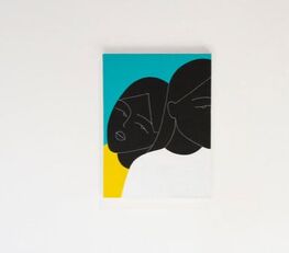
Johanna Olk, "Idle Youth" series. Piece #1
|

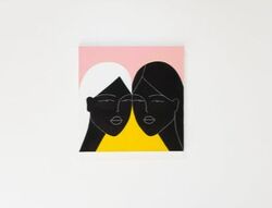
Johanna Olk, "Idle Youth" series. Piece # 3
|
My inspiration behind ¨Inserts¨ was a series called Idle Youth by Johanna Olk. I was inspired by the series as a whole but most specifically these two pieces from the series. Her first priority as an artist is to evoke emotions from her pieces. As an artist she believes that her work is emotionally driven. She creates these deeply rooted emotions by using personal experiences and what she knows. This is why many of her works have a central figure of a woman. The monotone colors and flat figures allow her to create a sense of no emotion thus creating a deeper development of emotion. The process behind her works vary from day to day, she stated that depending on her mood and where she is all are factors she takes into consideration when creating.
All of the above mentioned aspects I wanted to combined into my piece, because I have never created a piece like this. Many of my works focus on conveying a singular feeling but this time I wanted it to be up to the viewer. As well all of my past pieces consist of many more detail then a few lines and shapes.
All of the above mentioned aspects I wanted to combined into my piece, because I have never created a piece like this. Many of my works focus on conveying a singular feeling but this time I wanted it to be up to the viewer. As well all of my past pieces consist of many more detail then a few lines and shapes.
Planning
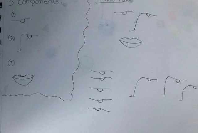
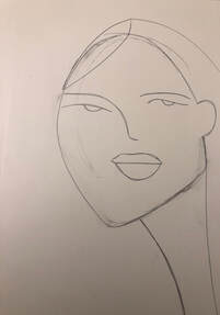
My first sketch I focused on creating similar facial features/structures as Olk. Although they are only composed of a few organic lines it took some time for me to get a technique that worked for me down. I found that it was simpler for me to make structures like the eyebrows and eyes similar, not the same. This not only made it easier for me to replicate her style but adds to the idea of the piece having no real motive behind it.
|
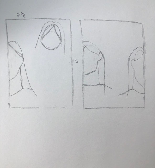
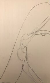
The second sketch I focused on the positioning of the actual figures. After looking at the Idle Youth series again I wanted my figures to be in different positions, however unlike Olk I didn't want to show the whole of a human figure because I felt that it would not add any meaning to my pieces. I liked the idea of having two different figures with different head positions.
|
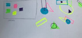
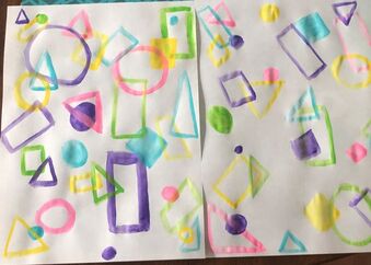
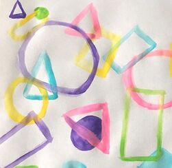
My last sketch I focused on the background and the placement of the figures. When composing potential backgrounds I found that I liked the look of overlapping shapes. With this sketch I experimented with different shapes, colors, and weather or not the shape was hollow or filled in. The color combination I liked was the green, purple, yellow, pink, and blue. I would later go on to use these colors for the final product.
|
Experimentation
|
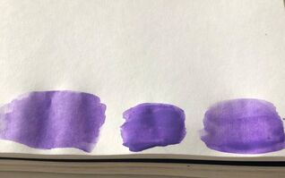
My experimentation focused on the acrylic paint that appears in the background, since in the past I've worked with the block print media.
To start I needed to find the right mixture of water to paint. I knew that the more water I added the more transparent the paint would become, however it would make the paint more runny. With this knowledge I mixed multiple colors of paint with varying amounts of water. |
|
|
When painting the actual background I had not set idea in mind. From my sketches I knew I wanted overlapping geometric shapes. I created two different potential backgrounds. When painting these I made sure to use the same color paints and shapes on each, I painted 2 possible backgrounds. After both were dried I ended up liking the first one more.
|
|
Process
|
|
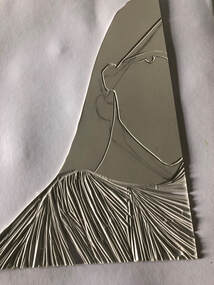
The first step in completing this piece was the transfer my sketches onto the linoleum. My sketches were a lot smaller then the actual linoleum so I had to resize then accordingly. Resizing them was important because I needed to make sure I had enough room left around the figure to fit the details of the backgrounds in.
|
|
|
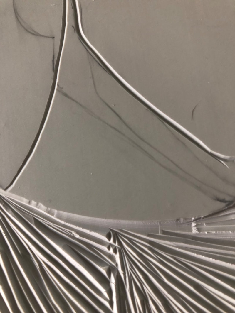
After I was happy with the size of figures on the linoleum I had to carve them. By looking at my inspiration majority of the piece was black, the technique used was done in paint. To create a similar effect in my piece I carved out the lines for any facial features. In the actual printing process they would appear white which would embody the look of my inspiration. Once both pieces were carved I cut any excess linoleum off, I followed closely to the lines that created the hair and any clothing.
|
|
Before I could begin printing I had to create the backgrounds. If I were to print and then paint over it the paint would not show over any of the ink since the ink is black. I used a variety of overlapping geometric shapes. The main shapes I stuck with were circles(hollow and solid), rectangles(hollow), and squares(hollow and solid). I also varied the sizes of the shapes.
|
|
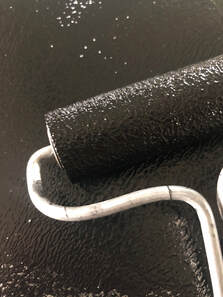
While the paint was drying I prepared the ink for printing. I placed a small amount of water based ink onto a metal sheet. I rolled the ink out with a brayer, I did this until the ink had rough texture look.
|
|
Again I rolled the brayer into the ink and applied an even layer of ink over one of the linoleum pieces. The even layers of ink would allow me to get a clean print. I wanted the print to be one even color, rather then having some darker or lighter spots. Once the ink was applied I placed the linoleum onto the paper with the background already painted on. On top of linoleum I placed another piece of paper. Using a baren I applied even amounts of pressure onto the linoleum to achieve a clean print.
|
Reflection
Now that this project is complete I feel that there are some aspects that could be improved to improve the overall appearance of the piece. I believe that I could have gotten a cleaner print of the figures if I were to print it again. This would have allowed for a higher contrast between the figures and the background, which is one of my original intentions for this particular piece. However I believe that this could be looked at as intention because of the meaning behind the piece.
When looking at this piece compared to my inspiration I feel I was able successfully develop a technique close to Olk´s. By looking at my work and my inspiration side to side you can see that my piece was heavily influenced by Olk however I was able to manipulate her use of color to add my own style to my piece.
When looking at this piece compared to my inspiration I feel I was able successfully develop a technique close to Olk´s. By looking at my work and my inspiration side to side you can see that my piece was heavily influenced by Olk however I was able to manipulate her use of color to add my own style to my piece.
Compare and Contrast
|
|
|
¨Inserts¨ v Idle Youth Piece # 1
Similarities:
- Both portray women as the main figure/focus of the piece
- Colors appears in the backgrounds, and is composed of more then one color
- Clothing appear in both pieces, however there appears to be of no importance
Differences:
- ¨Inserts¨ composition is more geometrical
- There figures that appear in ¨Inserts¨ are not close together unlike Olk´s work
¨Inserts¨ v Idle Youth Piece # 2
Similarities:
- Half of a face is showing
- Colors appears in the backgrounds, and is composed of more then one color
- Both figures are off center, which was a deliberate choice by both artists
Differences:
- ¨Inserts¨ composition is more geometrical
Similarities:
- Both portray women as the main figure/focus of the piece
- Colors appears in the backgrounds, and is composed of more then one color
- Clothing appear in both pieces, however there appears to be of no importance
Differences:
- ¨Inserts¨ composition is more geometrical
- There figures that appear in ¨Inserts¨ are not close together unlike Olk´s work
¨Inserts¨ v Idle Youth Piece # 2
Similarities:
- Half of a face is showing
- Colors appears in the backgrounds, and is composed of more then one color
- Both figures are off center, which was a deliberate choice by both artists
Differences:
- ¨Inserts¨ composition is more geometrical
ACT Response
Clearly explain how you are able to identify the cause effect relationship between your inspiration and its effect on your artwork?
The inspiration behind my piece is constructed using thin fluid lines with large patches on bright colors. Both of these elements can be seen in my piece.
What is the overall approach the author has regarding the topic of your inspiration?
The overall approach to my piece was to find pieces that would push my out of my comfort zone of making art. Many of my works are made up of multiple layers.
What kind of generalizations and conclusions have you discovered about people, ideas, culture, etc. while you researched your inspiration?
Artists are able to draw inspiration based on their own experiences, past and present. This is important because no one has the same experiences witch is why art is interpreted so differently by every person.
What is the central idea or theme around your inspirational research?.
The idea behind my inspiration was to find artists that used simple lines and shapes to create their works. I wanted the works I used as inspiration to have a high contrast color palette. Both of these elements are seen heavily throughout my piece. By piece has a minimalist look with high contrasting colors.
What kind of inferences did you make while reading your research?
Using what you know best as inspiration allows artists to create their own voices that are showcased in their works.
Bibliography
“ARTIST FEATURE: JOHANNA OLK.” Cortex Creatives, cortexcreatives.com/ARTIST-FEATURE-JOHANNA-OLK.
“Idle Youth by Johanna Olk.” 1700naud, www.1700naud.com/calendar/2018/10/23/idle-youth-a-show-by-johanna-olk.
“Idle Youth by Johanna Olk.” 1700naud, www.1700naud.com/calendar/2018/10/23/idle-youth-a-show-by-johanna-olk.
