|
Title: Self Reflecting
|
Exhibition Text
"Self Reflecting" was inspired by 2 artist, one well known and the other up and coming. The two artists that inspired "Self Reflecting" are Ines Longevial and Matisse. I was drawn to these two artist because their use of colors, however how they used these color, Matisse uses heavy blending of colors where as Longevial uses solid flat patches of colors. "Self Reflecting" is meant to show how you can be your worst critique, which highly contrasts from the pieces color palette. This is a direct correlation to the meaning of the piece, even with others reassurance you can still think what you are doing is not your best.
Inspiration
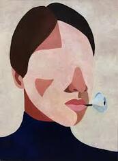
Ines Longevial
|
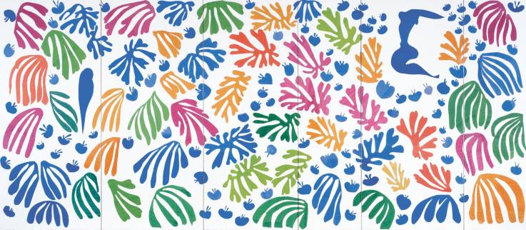
Henri Matisse, gouache on paper (1952).
|
As an artist Longevial challenges the way female forms are traditionally viewed, She uses unique colors and shapes to break the molds heavily emphasized by society. With each piece she creates she wants to showcase the diversity of women in a positive way. Her works are heavily influenced by the work of Picasso and the fields she grew up around, which is why many of her works include some form of nature. I was initially drawn to her art because almost all of her art have the same central theme, which is something I would like for my art to have.
Matisse wanted the art he produced to look simple to replicate, however this is not the case. The particular piece I chose as inspiration is part of his CutOut series, which consisted of pieces of paper being pasted down. The patterns created by the paper where brightly colored and looked to be very simple. With the CutOuts he created Matisse payed a high level of attention to the colors and forms he produced. I was draw to these pieces because of the look of simplicity they have, which I thought would be a good opportunity to use color as a way to express emotion.
Matisse wanted the art he produced to look simple to replicate, however this is not the case. The particular piece I chose as inspiration is part of his CutOut series, which consisted of pieces of paper being pasted down. The patterns created by the paper where brightly colored and looked to be very simple. With the CutOuts he created Matisse payed a high level of attention to the colors and forms he produced. I was draw to these pieces because of the look of simplicity they have, which I thought would be a good opportunity to use color as a way to express emotion.
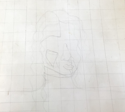
Planning Sketches
|
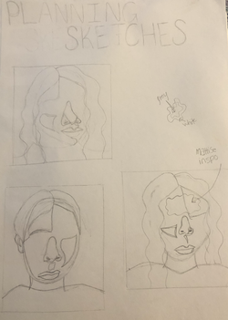
My planning sketches were heavily influenced by Longevail. Out of my three sketches the second sketch is the closest to the original, which is why I didn't go with it in the end. I felt that if I chose it it would look too much like the original.
For the final product I combined the first and third sketch. For the most part the two sketches look the same however I drew the noses different after looking at the two sketches I liked the way the nose in the first sketch looked. |
Experimentation

|
The first part of my experimentation was to make a color palette. The colors that are used by both artists are very vibrant so I wanted to make a final color palette. The way I did this was by mixing colors and making swatches of each so I could later refer to them if I needed to mix them again.
|

|
Initially when I was planning the background I knew I wanted it to brightly colored with layers. After finding some sponge brushes I decided that if I wanted to achieve a high level of layering I would have to use them. To achieve this look I started with a solid color that was not mixed with any other color. I then dipped the brush into the color and randomly dotted it on to the canvas in all different directions purposely leaving some large white spaces. after that was mostly dried I took the original color I used and added white. I used the same technique as I did in the first step, again leaving some white spaces.
|
Process
Before begining any sketching/painting on the canvas I had to construct the canvas. I made this canvas the last month of school. After the canvas was constructed and stretched I applied 2 layers of gesso, waiting for each coat to dry before adding another layer.
|
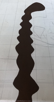
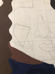
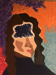
After deciding what sketch I was going to use I redrew it larger, and added a 12 x 12 grid to it. I then created the same grid on the canvas and transferred my image onto the canvas. with this step I decided it would be better for me to add the cut out part of the face later because I wanted the skin tones to continue around the cut out.
|
|
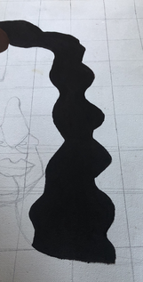
I first began to paint the hair. I decided to start with the lighter side because it would be easier to make the space where the two sides of hair meet neater with the darker brown. I created this color by mixing light brown with dark brown, and a little black.
|
|
To create this color I used a large amount of black with dark brown. To apply both colors of the hair I used a small square brush.
|
|
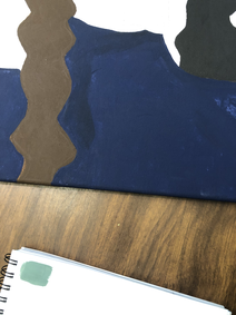
After the hair dried I moved onto the shirt. I used a color called navy blue. To apply the paint I went around any details with a small pointed brush and used a large square brush to fill in the space. The color I chose to paint the shirt was difficult to work with simply for the fact it was a more sheer color. I had to apply the same amount of paint to every area otherwise some parts would become darker then others.
|
|
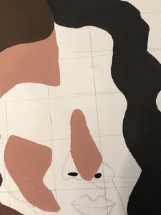
The next thing I worked on was the skin tones. I started with the neck since it is the darkest skin tone and would form the shape of the head. I mixed dark brown, burgundy, and back.
|
|
I moved onto the color that appears the second most out of the skin tones. To make this color I mixed tan, red, and light brown. To apply this color I used a small square brush since this color would meet the borders of other colors and I wanted then to be crisp.
|
|
I then mixed the base skin tone. I used tan, red, yellow, and a small amount of light brown. Again I used a small pointed brush brush to create a nice edge, and used a large square brush to fill itin.
|
|
I then created more shadows on the face by using light brown mixed with a small amount of white. To apply it I used a small square brush.
|
|
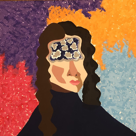
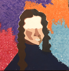
After the face was completed I mapped out the cut out of the face and painted it white, I made sure to leave a boarder so you could see the skin tones underneath. While that was drying I painted the background. The solid colors I used are called Purple, Light Blue, True Red, and Orange. To create the lighter colors that appear other each i mixed the solids with white. I used a sponge brush to apply all eight of the colors.
|
|
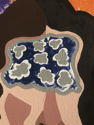
By the time I finished the background the cut out had dried. I then used the same technique with a sponge brush I discussed earlier. The color I used for this was the navy blue I used for the shirt.
|
|
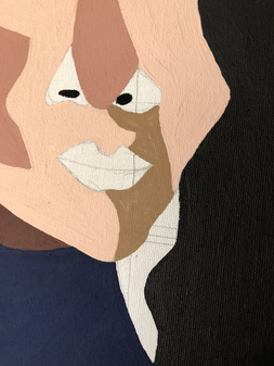
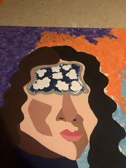
After that I dried I went along the edge of the cut out with the color Grey on a small pointed brush. I did this because the edges I created with the white looked a little rough.
|
|
I then took more white paint on a medium sized square brush and created a flower like design. This was a way for me to combined both of my inspiration into one component. The flower shape inspired by Longevial and the repetitiveness of the shape inspired by Matisse.
|
|
On a small square brush I took the same grey color I used for the outline and repeated the same design inside each one of the shapes.
|
Reflection

|

|
Ines Longevial v "Self Reflecting"
Similarities:
- Both pieces have a similar color scheme
- Both pieces have influences of nature, both pieces incorporate flowers
- The figures in both pieces are women
Differences:
- The background of "Self Reflecting" is made of vibrant hues were as Longevial piece is dull neutral colors
- " Self Reflecting" has a cut out on the face
- In Longevials piece there is really no pattern were as in "Self Reflecting" there is
CutOut v " Self Reflecting"
Similarities:
- Both pieces have a sense of repetition
- Both pieces are composed of bright vibrant hues
- The shapes that appear in both pieces appear to be simple
Differences:
- The background in " Self Reflecting" is made up of bright hues
- In the CutOut there are multiple patterns happening but in "Self Reflecting" there is only one.
Similarities:
- Both pieces have a similar color scheme
- Both pieces have influences of nature, both pieces incorporate flowers
- The figures in both pieces are women
Differences:
- The background of "Self Reflecting" is made of vibrant hues were as Longevial piece is dull neutral colors
- " Self Reflecting" has a cut out on the face
- In Longevials piece there is really no pattern were as in "Self Reflecting" there is
CutOut v " Self Reflecting"
Similarities:
- Both pieces have a sense of repetition
- Both pieces are composed of bright vibrant hues
- The shapes that appear in both pieces appear to be simple
Differences:
- The background in " Self Reflecting" is made up of bright hues
- In the CutOut there are multiple patterns happening but in "Self Reflecting" there is only one.
ACT Response
Clearly explain how you are able to identify the cause effect relationship between your inspiration and its effect on your artwork?
My inspiration for my piece were heavily influenced by their own lives and experiences. To express this they used color and shapes, both of which show up many times in my piece.
What is the overall approach the author has regarding the topic of your inspiration?
The overall approach was to use color and shapes as away to convey a message, without coming right out and stating it clearly.
What kind of generalizations and conclusions have you discovered about people, ideas, culture, etc. while you researched your inspiration?
A generalization I can now make is that artist use their own personal experiences to influence their art. This is why there is many reoccurring colors/shapes in artists works.
What is the central idea or theme around your inspirational research?
I wanted to find artist that used bright colors and simplified forms and shapes. I wanted the art almost to look flat patches of color.
What kind of inferences did you make while reading your research?
I learned that color and shape can truly affect the meaning and intentions of a piece, although it may become harder for the viewers to understand the meaning.
Biblography
Fuentes, María. “Inès Longevial: Metal Magazine.” English, Metal Magazine, 13 Aug. 2019, metalmagazine.eu/en/post/interview/ines-longevial-painted-poetry.
Honestly WTF, honestlywtf.com/art/ines-longevial/.
Wapshott, Nicholas. “Photos: Henri Matisse Cutouts: The Joy of 'Painting With Scissors'.” Newsweek, 4 Mar. 2016, www.newsweek.com/photos-henri-matisse-cutouts-joy-painting-scissors-280305.
Honestly WTF, honestlywtf.com/art/ines-longevial/.
Wapshott, Nicholas. “Photos: Henri Matisse Cutouts: The Joy of 'Painting With Scissors'.” Newsweek, 4 Mar. 2016, www.newsweek.com/photos-henri-matisse-cutouts-joy-painting-scissors-280305.
