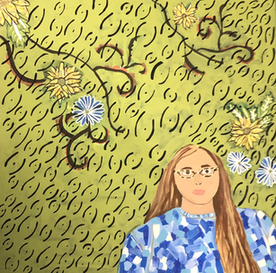
Artwork: Self Portrait
|
Title: Self Portrait
|
Exhibition Text
"Self Portrait" was inspired by Van Gogh's "Sunflowers" and "Portrait of Joseph Roulin", as well as the impasto technique. Van Gogh used bright vibrant colors to portray emotions, I emulated a similar theme to this. "Self Portrait" has a combination of both warm and cool toned colors. As well the figures that appear in Van Goghs work often have a neutral expression, their resting face. Again this is emulated in "Self Portrait". "Self Portrait" is more meant to show and emulate a well known technique of Van Gogh then have a central theme. However the theme of "Self Portrait" is how real life effects an artists color choices. This idea was a key point in Van Goghs process, which is why I believed that it should be the theme behind my piece. Not only was it a key point of Van Goghs creative process this was an interesting idea for me to explore, and hopefully something that I can incorporate into my future works.
Inspiration
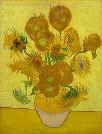
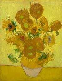
Vincent Van Gogh,(1889, January), "Sunflowers", 95 cm x 73 cm.
|
Van Gogh is most well known for one of his techniques, this technique consists of small brush strokes that are loosely placed on the canvas. These brush strokes he created varied in size in length, it is easy to distinguish between the different strokes because he often used more then one color on his brush when painting. Van Gogh would often use his color pallets to symbolize hardships he faced in life. These colors fall under two spectrum's, vibrant and bright or dark and vibrant. The subjects of his works were often nature and people. In some works that he created both people and nature are featured. The people featured in his works were often people of importance to him, another thing to note about the forms that appear in his pieces is that they have similar expressions. The expressions that appear are often neutral resting faces, this is a key aspect of Van Goghs work because he used his works to express himself. |

|
This way of painting allowed Van Gogh to make texture and movement on the canvas. This is what has allowed Van Gogh to stand out from different artists during his time and even till now. This technique has become known as impasto, to paint thickly. The success that Van Gogh was able to achieve in his pieces was a main point of inspiration for the further development of this technique.
|
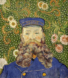
Vincent Van Gogh, (1889), "Portrait of Joseph Roulin", 64.4 x 55.2 cm.
Planning
|
My first sketch was more about figuring out how to simplify the flowers and patterns that appear in the background of "Portrait of Joseph Roulin". With this sketch I experimented with the positioning of the body and hair. In my inspiration piece my attention was drawn to the texture of the hair that makes up the beard. Since I wanted to create a similar texture with my hair I thought this would be the best way for me to do this.
As well with this sketch I decided that I wanted to incorporate another well known piece by Van Gogh. I decided that I wanted to incorporate the sunflowers to contrast the darkness of figure with the bright and frantic background. |
|
|
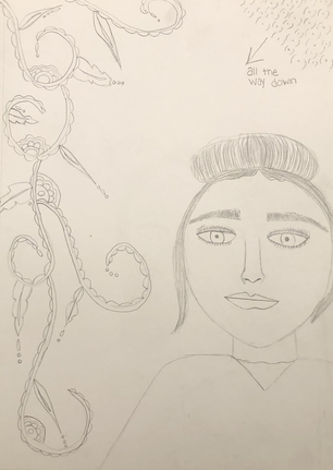
Again with this sketch I experimented with the body position and hair. I drew the figure off to the side to allow myself more room to focus on the flowers and vines in the background. I ended up not liking how this looked because it seemed like it was two different pieces put together. I also ended up not liking the hair. In the original piece the hair covers majority of the body and face, so by having the hair in the bun it strays away from my inspiration.
|
|
|
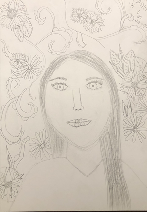
My last sketch I followed the closest to my inspiration. I simplified the patterns and shapes that appear in the background. With this sketch I wanted it to be the one that you could tell was heavily influenced by my inspiration. Like the first two sketches I added the sunflowers, however with this sketch I drew them how I wanted them to appear on the canvas.
When deciding what sketch I wanted to go with for the final piece I went with this one. I chose this sketch because you can see the obvious influence from my inspiration pieces. |
|
Experimentation
|
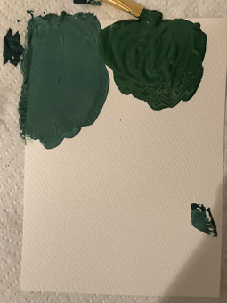
The first part of my experimentation was mixing the paint colors. The colors that I struggled the most with was the background and skin tone. The green that makes up majority of the background is a light green that is dark, I kept making the color to dark or to light. The skin tome that appears in my inspiration is very pale and has tints of green and red. When I first mixed the skin tone color I tried to mimic this color, I than decided that it would be best if I tried to make a color close to my actual skin color.
|
|
Another thing that I experimented with was the painting technique. Van Gogh had a very specific painting technique, However in "portrait of Joseph Roulin" it is hard to see his brushstrokes. This was a problem because Van Gogh used single brushstrokes to create texture to his pieces.
|
Process
Constructing the Canvas
|
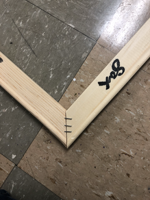
The first step of this project was to create the canvas. I first took 4 3ft stretcher bars and created a square. I used a triangle square to make sure that the corners were even so that the canvas would be a perfect square.
|
|
|
I then used a staple gun to connect the stretcher bars together, I put 3 staples in each corner. It doesn't matter how many staples you put, however it should be enough so that the frame will stay together on its own.
|
|
|
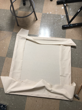
After the frame was put together I had to attach the canvas to the actual frame. I started this by stapling the canvas to the backside of frame, each time I did this I made sure to pull the canvas tight so that I would have a flat surface to paint on.
|
|
|
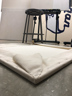
The next step was the corners of the canvas. In order to do this I folded the excess canvas on the back into a triangle that can't be seen from the front of canvas. After I was happy with the way that the canvas looked I again used the staple gun to fold the canvas in place. The last thing I did after all of the corners were complete, I cut off the remaining excess canvas.
|
|
|
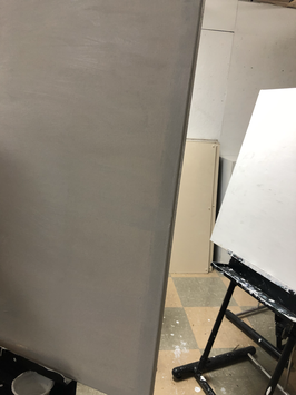
Before I could begin painting I had to gesso the canvas. I did this by using a large paintbrush and up and down brushstrokes. I added about 3 layers of gesso.
|
|
Preparation Before Painting
|
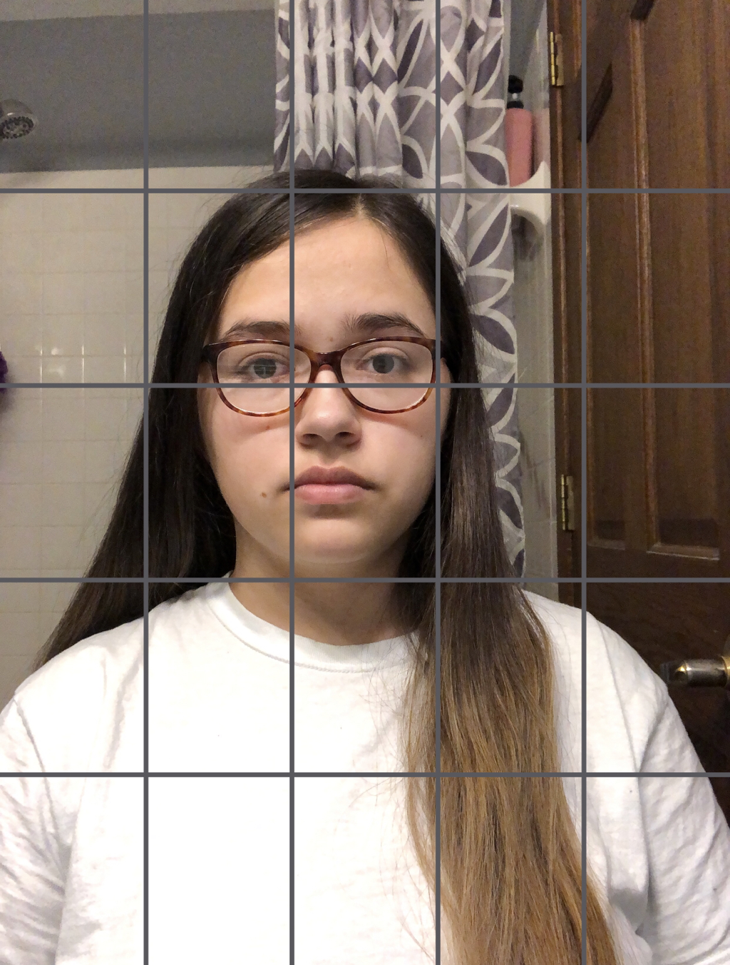
I decided that I wanted to use the grid method to paint my piece, so in order to do this I needed a reference photo. After I was happy with a photo of myself I added a 5x5 grid on top of the picture. The grid that I drew on the canvas ended up being a 9x9 grid, the reason that I made the grid on the photo of myself smaller was so that I would have room for the details in the background.
|
|
Painting the Portrait
|
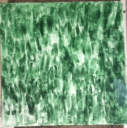
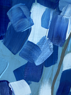
The first part of the canvas I painted was the background, I did a wash of the background color. However after doing this I realized that the color was a lot more dark then any other color in the portrait which would make it hard to see my drawings on the canvas. As well I ran out of the green I was using to paint the background, this was as far as I got. After the wash dried I drew on my 9x9 grid with a black color pencil so that it would not smear.
|
|
|
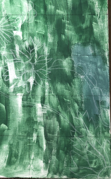
After the grid was on I used my reference photo of myself to transfer the image onto the canvas. Once I transferred the image of myself I began drawing the flowers and vines in the background. I used both a black and white colored pencils to do this, I found that the white showed up more clear against the darkness of the background color.
|
|
|
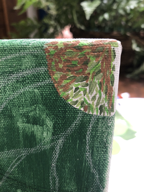
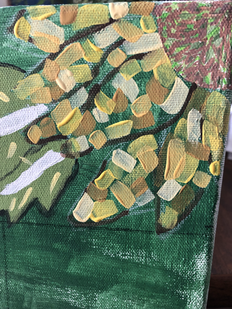
After I was happy with the placement and size of everything I began painting the flowers. I first painted the middle of each flower using different shades of green and brown like in Van Gogh's "Sunflowers". To create a similar affect to Van Gogh I used small brushstrokes, and didn't worry about the placement of each stroke.
|
|
|
I then moved onto the petals of the sunflowers. I used the same technique I used for the centers of the flowers, except I used a larger brush. After majority of the petals were filled in I went around the edge of each petal with a dark brown that was mixed with water to distinguish the different sizes and shapes of the petals. I did this because in "Sunflowers" it is easy to tell each petal apart from the next.
|
|
|
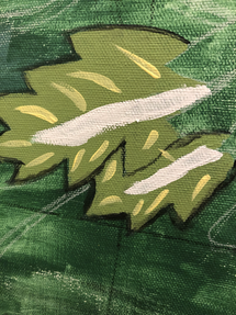
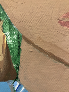
The next thing that I painted was the leafs. First I used a light green to paint the whole leaf. Next I used a light yellow mixed with water to create the veins on the leaf. When creating the veins I wanted then to look random and quick like in " Portrait of Joseph Roulin". Then I outlined the whole leaf with a watered down black. For the last two steps I used a small brush.
|
|
|
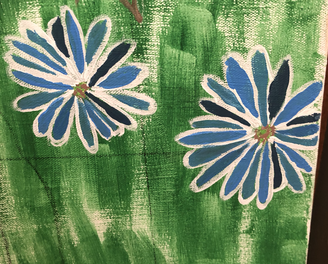
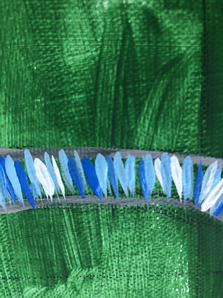
I then moved onto painting the daisies. I first used a small brush to outline each petal with white. After that dried I used 4 different shades of blue(I created these by adding varying amounts of white and black) to paint the petals. In the original "Portrait of Joseph Roulin" the flowers that appear in the background are more warm toned, in my piece I wanted there to be contrast in the background and from, as well as in the background itself.
|
|
|
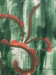
After completing the flowers I moved onto the vines. When painting these I wanted them to be a dark brown so that they would contrast the background color as well as the pattern that comes off them. I knew that since I wanted the vines to be dark I should start with the pink for the pattern since it was much lighter than the brown I ended up using. To complete this step I used a small brush to go around the edges and then used a larger brush to fill everything in.
|
|
|
|
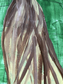
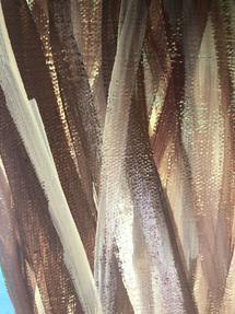
Before I began painting myself I moved the sketch on the canvas more to the left so that it would be more similar to my inspiration. When painting myself my tactic was to start with the larger areas, so I started with my hair. First I went over the hair area with white(I used titanium white)so that I would have an even base. I first started with the lightest and darkest colors in my hair. In my reference photo parts of my hair were broken into sections, to show this I used the darkest brown. I then used the lightest color to show highlights. I then layered different shades of brown and yellow until I was happy with the way the hair looked.
|
|
|
|
The next part of my figure that I painted was my shirt. In my inspiration the clothing that appears is blue so I decided that I wanted my shirt to be blue. Again I applied a layer of white so I would have a even base. I first used a light grey to represent the creases and seams in my shirt. I next used multiple shades of light blue to fill in the remaining areas of the shirt.
|
|
|
|
The next part that I completed was my face and neck. I started by applying a layer of white. After mixing a skin tone that I was happy with I began painting the neck. Next I moved onto the face. By looking at my inspiration I saw that all of the facial features were outlined with a light grey color, so I outlined my features in a lightly darker shade then the skin tone that I made. I then continued to paint my face.
|
|
|
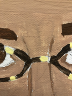
The next part of my piece that I completed was my glasses. For me this was the most difficult because it was hard for me to mimic that pattern on my glasses in such a small area. However what I did was started with the pattern because it is so much lighter than the actual base color of the frames.
|
|
|
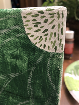
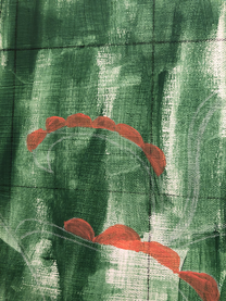
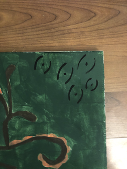
Lastly I finished the background. I did this by adding 2 more layers of the green(I made this color by mixing titanium white, black, and holiday green). After that dried I began to paint a similar pattern that appears in "Portrait of Joseph Roulin", however in this piece the pattern is made by using white and black. When creating the pattern on my piece I just used black because I wanted the flowers in the background to stand out.
|
|
Reflection
After looking at the final piece I think I could have found a way to incorporate "Sunflowers" more. However I am happy with the way the petals turned out. Another aspect from the flowers that could be improved is the middles. I tried to emulate the centers from "Sunflowers" but they ended up being to lime green, as well the brown I added to the centers looks more mauve than brown. The blues I used to create the petals on the daisies I feel are to similar in color to each other but they match well with the pattern on the shirt. I also think that the body of the figure looks to wide for the head, however I believe this could be because of the pattern I decided to fill in the shirt with.
I believe I should have applied a layer of white before painting any aspects of the piece. I really only did this when I painted the figure. The part of the figure that I am most happy with is the skin tone because I often struggle to make them. Overall I an happy with the way the final piece looks.
I believe I should have applied a layer of white before painting any aspects of the piece. I really only did this when I painted the figure. The part of the figure that I am most happy with is the skin tone because I often struggle to make them. Overall I an happy with the way the final piece looks.
Compare and Contrast
|
|

|
"Sunflowers" & "Self Portrait"
Similarities:
- The color scheme of the sunflowers in both pieces are similar.
- Each petal of all the flowers that appear in both pieces can easily be distinguished between.
Differences:
- In "Sunflowers" the flowers are the main form, whereas in "Self Portrait" they appear in the background and the main form is myself.
- The techniques that were used to paint the flowers in both pieces differ greatly from each other.
- "Sunflowers" has a warm tone palette, but "Self Portrait" has a cooler tone palette with only a small amount of warn tones.
- "Self Portrait" has more business in the background compared to "Sunflowers" that is one solid shade of yellow.
"Portrait of Joseph Roulin" & "Self Portrait"
Similarities:
- The placement of the flowers in "Self Portrait" closely resembles "Portrait of Joseph Roulin".
- The placement of the human forms in both pieces is similar, as well both forms have similar expressions.
- Both pieces have a similar pattern repeated throughout the background in the negative space.
- Both pieces were painted using a similar technique of quick small brushstrokes, which add texture to the pieces.
Differences:
- "Self Portrait" has more contrast in the colors that appear in the background.
- The clothing that appears in "Self Portrait" is more modern.
- Sunflowers appear in the background of "Self Portrait",, where as in "Portrait of Joseph Roulin" the flowers are much simpler and childlike.
Similarities:
- The color scheme of the sunflowers in both pieces are similar.
- Each petal of all the flowers that appear in both pieces can easily be distinguished between.
Differences:
- In "Sunflowers" the flowers are the main form, whereas in "Self Portrait" they appear in the background and the main form is myself.
- The techniques that were used to paint the flowers in both pieces differ greatly from each other.
- "Sunflowers" has a warm tone palette, but "Self Portrait" has a cooler tone palette with only a small amount of warn tones.
- "Self Portrait" has more business in the background compared to "Sunflowers" that is one solid shade of yellow.
"Portrait of Joseph Roulin" & "Self Portrait"
Similarities:
- The placement of the flowers in "Self Portrait" closely resembles "Portrait of Joseph Roulin".
- The placement of the human forms in both pieces is similar, as well both forms have similar expressions.
- Both pieces have a similar pattern repeated throughout the background in the negative space.
- Both pieces were painted using a similar technique of quick small brushstrokes, which add texture to the pieces.
Differences:
- "Self Portrait" has more contrast in the colors that appear in the background.
- The clothing that appears in "Self Portrait" is more modern.
- Sunflowers appear in the background of "Self Portrait",, where as in "Portrait of Joseph Roulin" the flowers are much simpler and childlike.
ACT Response
Clearly explain how you are able to identify the cause effect relationship between your inspiration and its effect on your artwork?
By looking at the work I created inspired by Van Gogh similar techniques in the way that the paint was applied. By using two of his well known pieces and a similar style it allows the viewer to recognize the piece was inspired by Van Gogh.
What is the overall approach the author has regarding the topic of your inspiration?
The overall approach to finding inspiration for this piece was to find well known pieces which would allow the viewer to easily establish what parts of my piece were inspired. Another approach was finding an artist that has/had a well know technique, which again would allow the viewers to easily distinguish who inspired my piece.
What kind of generalizations and conclusions have you discovered about people, ideas, culture, etc. while you researched your inspiration?
A generalization I can now make about ideas behind pieces is artists often use their own lives as a source for inspiration.
What is the central idea or theme around your inspirational research?
When I was doing research for my inspirations I wanted to use pieces that were well known so that it would be easy to identify what parts of my piece were inspired by the well known work.
What kind of inferences did you make while reading your research?
An inference that I can now make is that everyday life and the emotions that come from these experiences can be a main source of inspiration. Emotions are interpreted by everyone differently which is why viewers of art pieces often feel that piece means something differently.
Bibliography
“MoMA Learning.” MoMA, www.moma.org/learn/moma_learning/vincent-van-gogh-portrait-of-joseph-roulin-1889/.
“Sunflowers.” Van Gogh Museum, www.vangoghmuseum.nl/en/collection/s0031V1962.“MoMA Learning.” MoMA, www.moma.org/learn/moma_learning/vincent-van-gogh-portrait-of-joseph-roulin-1889/
“Sunflowers.” Van Gogh Museum, www.vangoghmuseum.nl/en/collection/s0031V1962.“MoMA Learning.” MoMA, www.moma.org/learn/moma_learning/vincent-van-gogh-portrait-of-joseph-roulin-1889/
